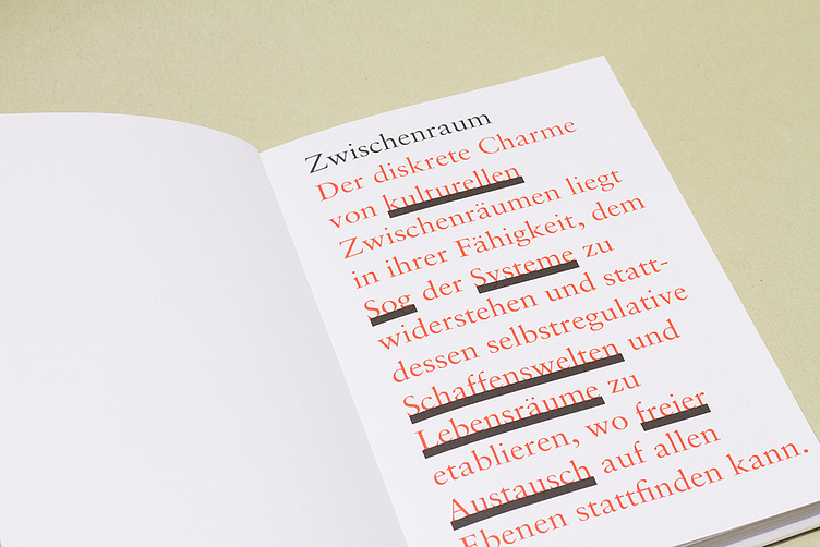
Zwischenraum

Zwischenraum
I named this book Zwischenraum to create a connection between architecture and literature. Black, solid bars symbolize the compact and stable nature of architecture, offering a striking contrast to the fine, elegant typography. The book is printed on bright white, uncoated paper, further emphasizing this sense of clarity and rigidity.
Throughout the entire book, I used the typeface "Sabon"—a classic, elegant, and highly legible book font. The black bars placed between the lines invite the reader to pause, creating a "space in between" for reflection. These interspaces are deliberately positioned at moments where the reader is encouraged to stop and linger, interrupting the flow of reading to allow for deeper engagement with the text.