Namene
Brand Design
Since the company has been evolving into a clean technology company, a brand redesign was needed to embody the 'new dawn' strategy with its refreshed purpose and values.
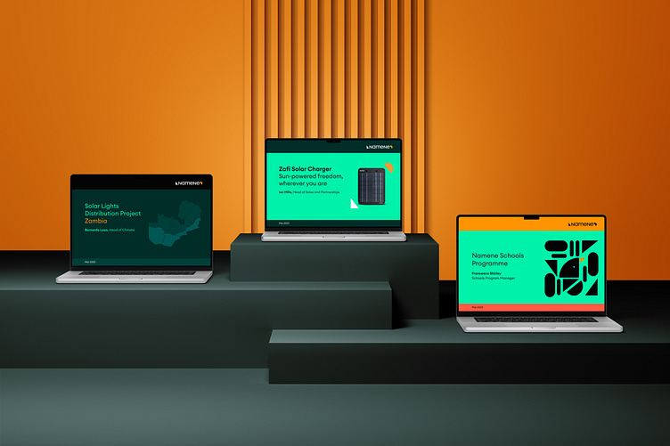
Namene believes that business can be a force for good, with the purpose of empowering every community — no matter where they live — through clean technology. Just like their products, we have thoughtfully crafted every element of the new brand to reflect that purpose. The versatility of the new design echoes the adaptability of the products and business model, while the playful graphic elements and vivid colours represent the joy they bring to the customers.
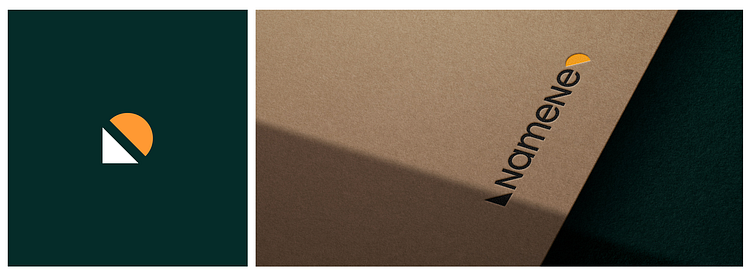
We use the semicircle and triangle in our visual concept to symbolise the idea of a 'new dawn', representing fresh beginnings and the promise of a brighter future. These shapes suggest a rising sun and reflect our solar energy roots, symbolizing innovation and our commitment to clean technology.
Brand Design Exploration and Creation
Brand Design Concept
Brand Guidelines
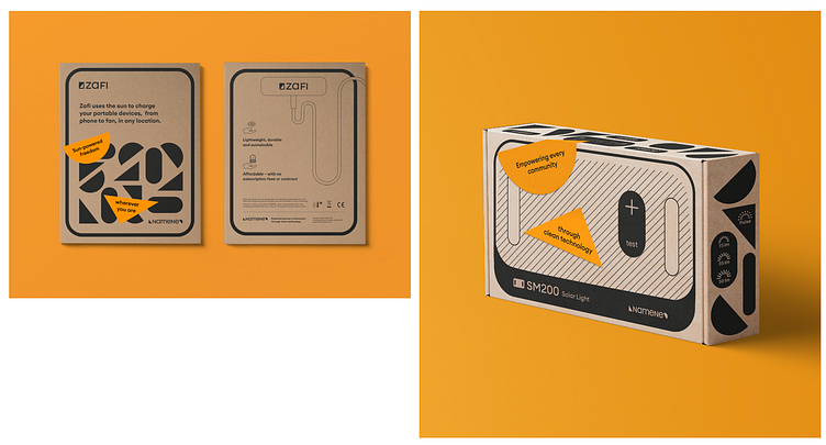
Packaging Design
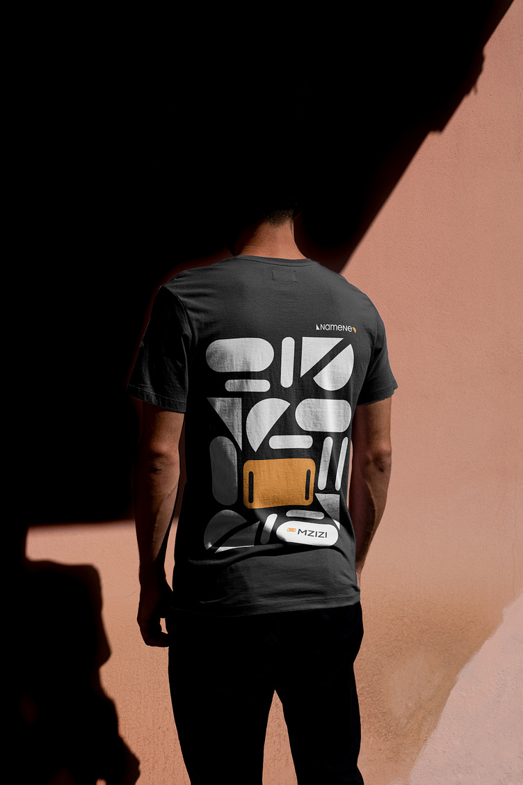
The patterns are intricately designed using the formal language of the products, complemented by the logomark's semicircle, and both right-angled unequal and isosceles triangles. These elements are carefully combined to form the core of the visual identity, reflecting the simplicity, modularity, and versatility of the products while enhancing the adaptability and coherence of the brand.