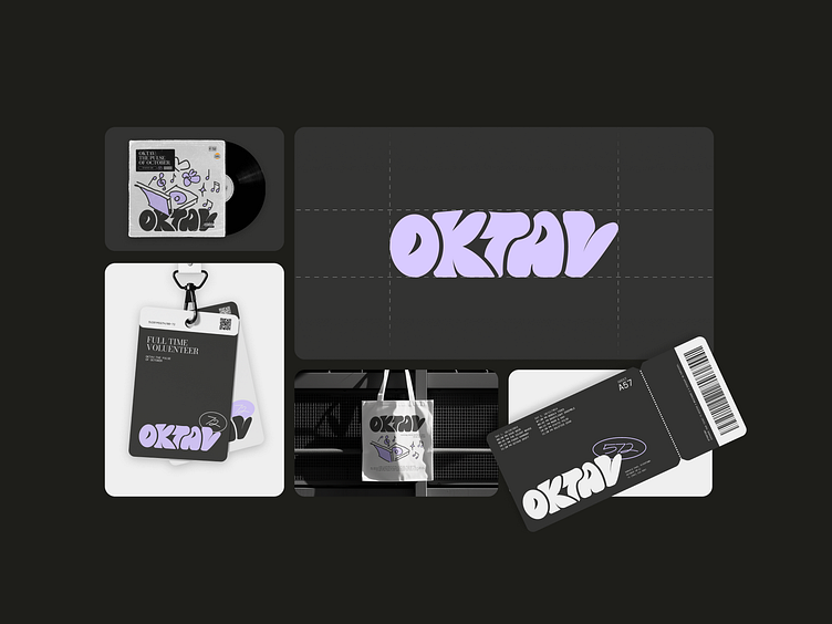
OKTAV - Music Festivals
OKTAF - OVERVIEW
Rooted in the spirit of rebellion and individuality, Oktav’s visual identity blends urban graffiti-inspired illustrations with bold, feminine gradients of pink, symbolizing freedom and decisive action. This dynamic aesthetic is complemented by a mix of serif typography, evoking the timeless depth of live music, and mono typefaces, reflecting modern urban energy. Together, these elements create a gritty yet refined brand language that captures Oktav’s mission: to transform every performance into a masterpiece, every note into a memory, and every moment into a celebration of music without limits.
More by Hive Studio View profile
Like


