Easy Trader’s Custom Icon Family
Easy Trader’s Custom Icon Family
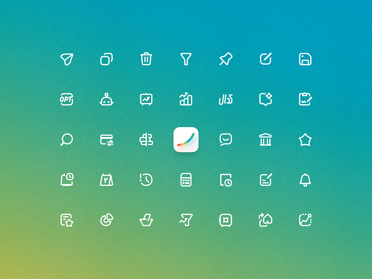
Aligned Easy Trader’s visual identity with a custom-made icon family that not only solved technical challenges but also enhanced usability and ensured a seamless design experience across the platform.
Hey Dribbblers 👋🏻
At Easy Trader, we initially used Material Design icons to enhance the user experience. However, we faced several limitations: the specific icons we needed weren’t available, and importing a large set of icons caused technical issues. Additionally, the icons didn’t align with the visual identity of our product.
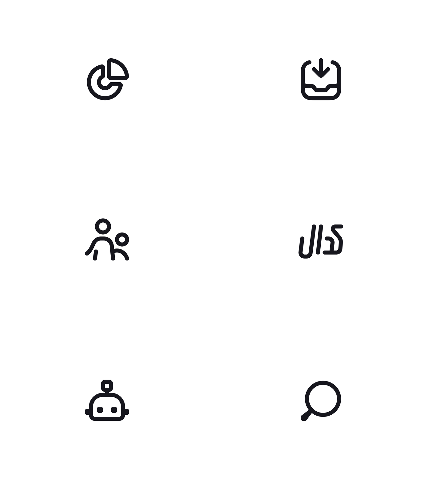
To solve these challenges, I designed a custom icon family that better fits both the functionality and the aesthetic of Easy Trader. The result? A more optimized experience with a more cohesive look.
What do you think? Feel free to share your thoughts!
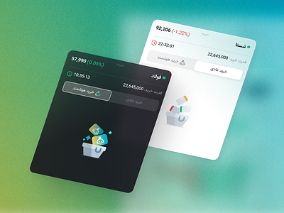
In the near future, I’ll also be sharing more images of the new interface where the icons are implemented.
Thanks for checking out my latest design! If you're interested in a custom piece, I'd love to hear from you. DM or email me. And of course, don't forget to follow me on Instagram & LinkedIn for more creative stuff.


