Enhancing the Order Experience
Interactive Switch: Enhancing the Order Experience
Hey Dribbblers 👋
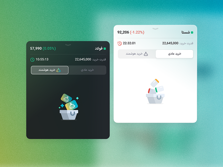
We recently added a new feature to Easy Trader: Algorithmic Orders. I’ll explain more about it soon! Since Algorithmic Orders are essentially another type of order, they needed to be integrated into the orders card. I achieved this with a segmented component but also needed to design an interaction to clearly distinguish between the standard and algorithmic order modes. The interaction happens right after the segment switch and is placed at the center of the card to make the difference really noticeable. Plus, the card content loads almost instantly after switching.
The interface and visuals were designed in Figma, as usual. However, in the final output, the order basket images load with a smooth animation. Can't wait to hear your thoughts!
Thanks for checking out my latest design! If you're interested in a custom piece, I'd love to hear from you. DM or email me. And of course, don't forget to follow me on Instagram & LinkedIn for more creative stuff.

