Redesigned Mobile Navigation ✦ Kaged
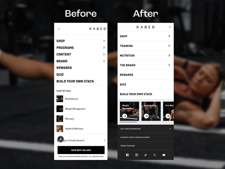
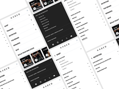
In this redesign of Kaged's mobile menu, we focused on simplifying navigation and enhancing user experience. The renaming of sections, such as changing "Programs" to "Training" and "Content" to "Nutrition," made it easier for customers to find what they were looking for intuitively. We also streamlined the layout, reducing clutter and improving the logical flow of categories. Additionally, the bottom section of the menu was optimized to include key features like login/account creation, order tracking, and social media icons, all of which make it easier for users to access important information. These changes helped improve usability by offering a more organized and efficient mobile shopping experience.
About Prismfly
Driving revenue for eCommerce brands through conversion rate optimization, full-stack development, branding, UI/UX design, and lifecycle marketing services.
learn more at www.prismfly.com
or reach us directly at contact@prismfly.com

