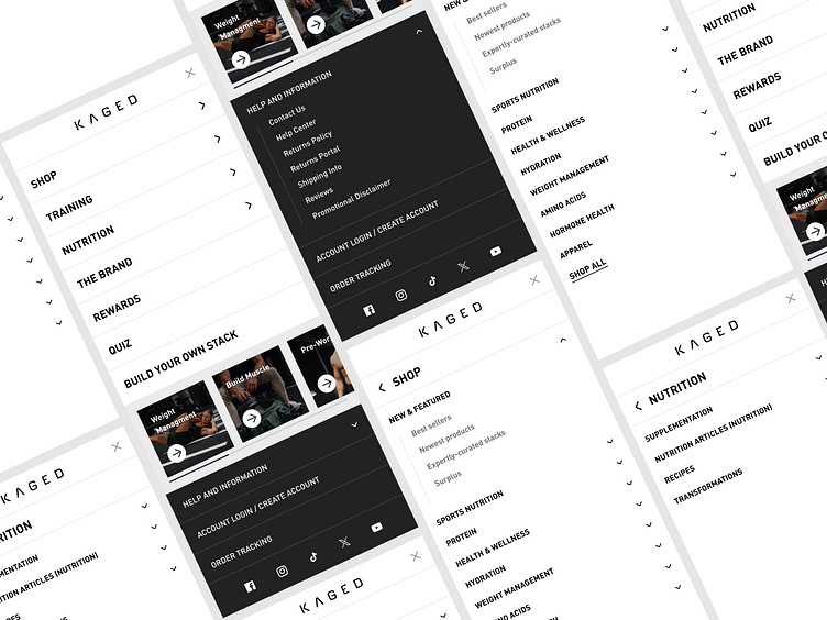
Refined and Optimized Mobile Navigation ✦ Kaged
Introducing the revamped mobile navigation for Kaged—designed with a focus on user experience, ease of access, and intuitive structure. The "Before" navigation presented a functional but cluttered interface, making it harder for users to seamlessly explore different categories.
In this redesign, we not only implemented a clean and organized menu structure but also took a deep dive into the naming conventions. By updating the naming structure for easier comprehension, we’ve made it more intuitive for users to find what they're looking for at a glance. Key improvements include a collapsible category system, enhanced visual hierarchy, and a more accessible footer for essential help and account-related actions. This refresh not only streamlines the shopping journey but also aligns the navigation with Kaged’s premium brand identity.
About Prismfly
Driving revenue for eCommerce brands through conversion rate optimization, full-stack development, branding, UI/UX design, and lifecycle marketing services.
learn more at www.prismfly.com
or reach us directly at contact@prismfly.com
