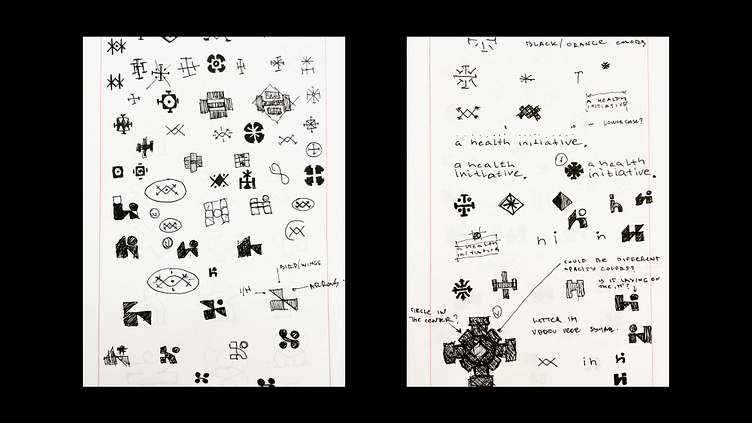
Logo Design Sketches of HI Letters Logo Design
We always start by sketching numerous ideas on paper to explore different possibilities. One of the concepts was to combine the letters "H" and "I" using modern geometric shapes. This idea aligned with the client's desire to emphasize movement and transformation, which reflects the brand's focus on continual progress and development. The logo captures the essence of ongoing progression, embracing imperfection as an integral part of the transformation journey.
Need a logo? Let's chat - logotypely@gmail.com
Want to see more? Follow us - instagram.com/logotypely
Check out the full project - https://logotypely.com/branding-for-a-health-initiative
More by Logotypely Team View profile
Services by Logotypely
Like

