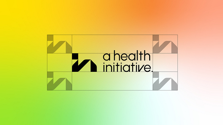
The Energy of Geometric IH Monogram Logo Design for Sport Brand.
We always start by sketching numerous ideas on paper to explore different possibilities. One of the concepts was to combine the letters "H" and "I" using modern geometric shapes. This idea aligned with the client's desire to emphasize movement and transformation, which reflects the brand's focus on continual progress and development. The logo captures the essence of ongoing progression, embracing imperfection as an integral part of the transformation journey.
The branding solution features a dynamic, abstract logo design incorporating geometric shapes that spell "HI," symbolizing constant motion and transformation. The use of bright, contrasting colors highlights the vibrancy and energy of the target audience. The logo’s contemporary design is versatile, making it suitable for various applications across the brand's athleisure products.
Need a logo? Let's chat - logotypely@gmail.com
Want to see more? Follow us - instagram.com/logotypely
Check out the full project - https://logotypely.com/branding-for-a-health-initiative
