Z2A Digital - Blog
Slap a logo and move on: or what really matters when applying branding to a website.
We wouldn't be talking about this if it wasn't a problem (sometimes). But in reality, a website might have an unclear role and relation with branding. Sometimes, it may exist without a clear purpose and strategy because it just has to exist, or it’s created as the main medium for branding which is spread into other assets afterwards.
In this article, we want to focus on more strategic and abstract concepts and move away from advices like “apply a palette in a way that evokes emotions you want” – it’s still a correct advice, but there’s enough articles like this already, so be prepared for broader insights.
Consistent experience
This advice might seem unusual or not immediately helpful to some, but let’s think of it this way: you’re not applying brand identity to a website, you’re creating a website within a brand ecosystem. What you want to achieve is a consistent experience across all touchpoints. In today’s multi-channel environment, where users encounter your brand on multiple platforms at the same time, it’s essential to maintain a consistent experience so that visitors clearly recognize they’re interacting with the same company.
Even though we’re on a brand identity topic (seemingly), it’s worth mentioning having brand strategy, as well as USP and TA which you absolutely need to understand in order to make things work properly. We want a website that’s helpful for customers, beneficial for a company, and that creates connection with the brand. You’re unlikely to achieve these having only a logo and a palette. But these will make even a visual application more meaningful.
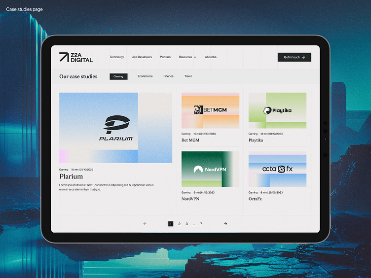
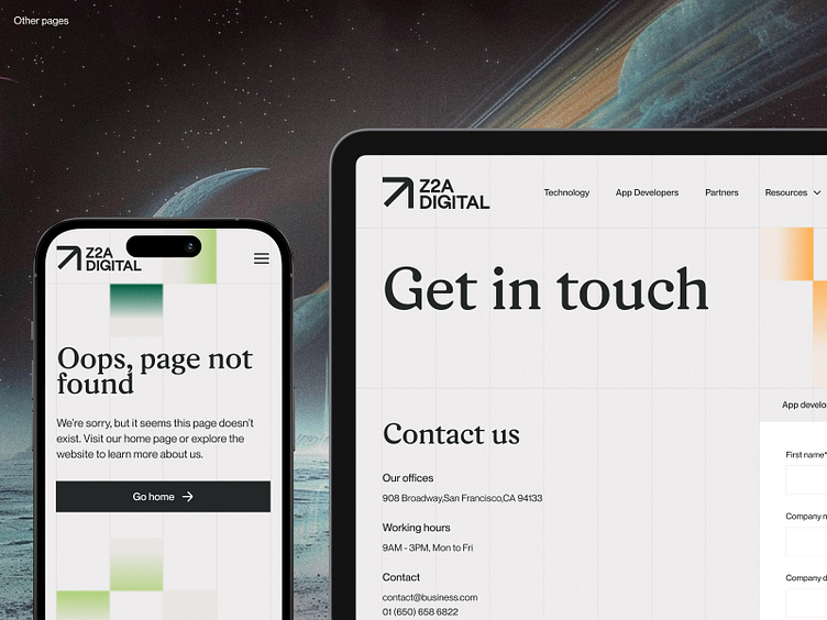
So what we want to ensure at this point is consistency – not only across brand channels, but also within a website. Contact page doesn’t have to be less refined and “branded” than Services or About us.
Visual adjustments
We have to break our promise and talk about colors, but just for a second. The thing is, sometimes colors come out not modern enough when applied to a website even though they seemed fine during brand design stage. Big oops. Of course it’s better to follow a process that won’t let you make this mistake, but still, if you found yourself in a situation when brand colors look well on physical assets but outdated in digital ones, this is the opportunity to revise the palette and ensure a consistent look. Which doesn’t have to mean unifying all the colors – we all know the reality of CMYK and necessity to select colors thoroughly, so feel free to keep those that look nice in print, just make sure your website makes as good impression as your whole brand.
So you’ve put a logo in the navigation bar, applied your brand colors and typography and used some photos that were marked as ”Do’s” in the brand guidelines, what’s next? If this is all you did because the brand guidelines you got are MVP-ish, you need to know that the job is not done yet. Moreover, even if they seem to be full, but they don’t include a website application, you may face the same problem as those with mini-guideline.
You see, a good brand identity never ends on the brand guidelines. It’s rather a framework that sets a brand up for further organic development. Website itself is a whole big universe so it’s fine if visual identity needs some adjustments or extension in order to work well with this medium. Revise the techniques and graphics available to you. What you need right now is a visual system that is scalable and flexible enough. If there’re gaps, if the branding doesn’t “work” on some pages or the website is getting too monotonous, define those areas and see how the identity can evolve to meet the requirements of those use cases.
The secret sauce that ties everything together
Seems like the job is done? We’re not quite there yet (such a painful thing to hear for designers). There’s a few things left that can really make or break the experience so it’s not worth saving on these (neither time, nor money).
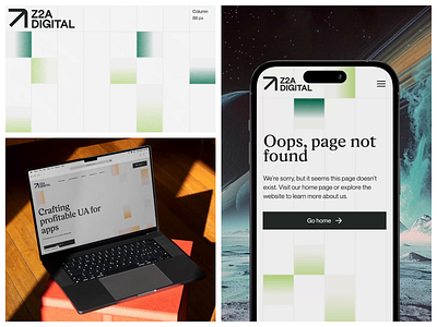
Often underestimated, but so powerful – words. Copywriting is just as much an integral part of a brand as a logo and other typically visual elements. Make sure that your website copy reflects your brand’s character and values and matches the Voice and Tone defined in the guidelines. No matter if it’s the products descriptions, company history, or error pages – whatever defines your brand language, can be implemented.
Another intangible yet important component of the brand experience is motion. It’s almost impossible to imagine a professionally executed website that has no animations at all. And here we mean both states, appearance animation, and interactions. Still, having just any animations or a lot of them is not what we suggest. Everything that’s moving (or not) will contribute to the overall experience, so make sure that the website you’re crafting is well matched with the brand character. If your brand should be perceived as soft and harmonious, consider replicating smooth and refined movement. But if your brand is energetic and innovative, sticking to dynamic and unconventional animations may be a better idea.
Final touches
If you've made it this far and covered all the previous points, congratulations – you've done an excellent job! Now is the perfect time to circle back to brand guidelines and update them with everything that has been introduced in the website and makes strategic sense (i.e. animation principles).
Seems like this is it! But we hope you didn’t forget about mobile version, right? ;) There’s still enough limitations that we need to remember about when working with mobile versions, so make sure that these constraints won’t affect the perception heavily.