Z2A Digital - Website
What Blade Runner has to do with Unikorns or how we worked with retro-futurism in our latest project.
We just lived our lives and didn’t think much about it until one day our client said “THIS”. Yes, he asked for a retro-futuristic look of the brand. It’s a very specific yet uncommon request, right? Futuristic visions from the past blended with nostalgic flavor is something we’re familiar with, but it was the first time we were talking about this in the context of a real project. The client’s company was a mobile ad-tech agency doing techy things but somehow, a retro vibe was a thing for them. It promised to be challenging but we saw the opportunity and dived in.
It started just like many other projects: Z2A Digital reached out to us for a brand identity and a website. The company was growing and it became clear that the current look was doing more harm than good which was the primary reason for the rebranding. We needed to rethink their brand image and polish it with the website design and development to set them up for a good launch. So, we were well prepared for a smooth project progress thanks to our expertise in such things. But this project turned out to be a way out of the comfort zone.
It was one of the very few projects where we had to reiterate on the moodboards. It doesn’t happen often, but when it does – we remember it later. Basically, the process in this project is an interesting subject that gave us some extra experience points, but it deserves a separate article so we’ll keep it for the next stories and move directly to the day when the retro topic came up. But let's agree on this: this style is what we absolutely needed.
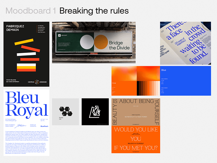
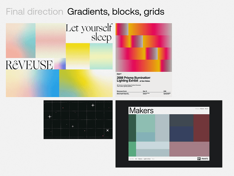
We scratched our heads because the whole situation looked quite like a challenge – how do we achieve “bright but muted colors”? The process was collaborative so you might have guessed that these were the client’s words but the thing is that we wholeheartedly understood this. The colors had to be like this. And the rest of the brand had to refer to such contrasts too. The whole idea of this movement is one big contradiction and still, it had to be relevant for our times.
Sticking to an unpopular visual direction may be tricky too. You see, when you think of retro-futurism, it’s mostly movies, architecture, and illustrations that come to mind. Quite a great inspiration but let’s be honest – designers look through similar works before doing their own. It’s just a healthy curiosity to know how others solved these problems and the desire to avoid accidental plagiarism. But there’s not much websites or modern brand identities made with this visual approach. So, as pretentious as it may sound, it might have been us who created something that others will refer to.
But sometimes you focus so hard on getting the steps right that you end up dancing in the wrong room. This whole retro thing was new to us, right? And since it was something new, we decided to play scientists and try to analyze the whole direction to extract specific visual techniques and ideas that, if applied to designs, would make them retro-futuristic. What makes them retro? What makes them futuristic? What should we add to make the design modern and not comical?
We were doing it wrong and cared about the wrong things. No one loves retro-futurism for a specific font or color combination. It’s the vibe, the feeling that people have that makes them want to see, listen to, or experience something. Loving the smell of gingerbread and not liking the taste can go hand in hand because you don’t have to eat it to enjoy the Christmas atmosphere. That being said, we switched our focus and started to think about how it should feel instead of what elements will help to achieve this.
Things got easier, but at the same time, they didn’t. By that moment, we have already had a comprehensive moodboard/reference board with things that we love and ideas we would like to include, so specific elements were not a problem. Achieving the desired feeling is where the issue comes in because impressions are subjective and there’s no correct way to achieve one.
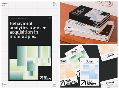
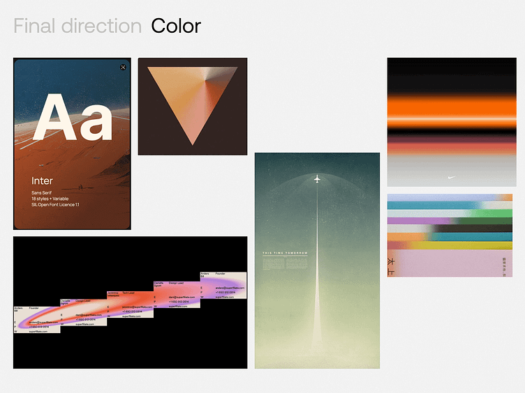
In this case, we placed a big emphasis on color – it was one of the main tools in achieving the desired effect. Faded neutrals and muted accents is what set the tone for the brand, even though some colors are visibly more saturated than you would probably expect from retro designs (but this is where the “modern” aspect comes into play – we needed balance, after all).
They say, there are two opposite sub-categories within retro-futurism: positive and negative. The first one is about living a bright utopian dream and the second one has a more flawed perspective on technology. We kind of combined both and got inspired not only by a warm sunrise but also by Star Wars, Star Trek, and Blade Runner.
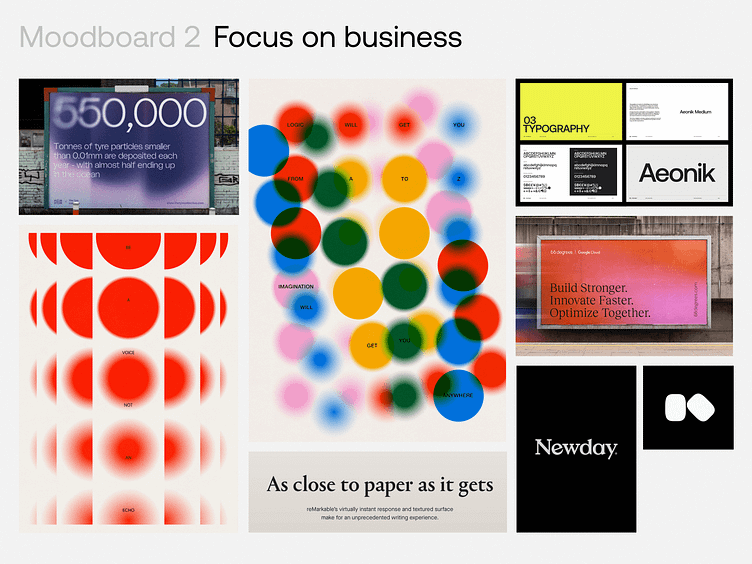
Even though the use of noise texture is common now, we decided to apply it to our designs too – to both graphic things and the website. It was the case where it actually brought something and looked natural.
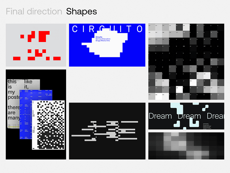
We also got inspired by the idea of screens and pixels where the “blinking squares” originated from. This idea has been later developed into larger blocks that allowed us to achieve the sense of movement and not get too dated. The website uses these artifacts pretty well, especially thanks to the actual motion. But to bring even more liveliness, we opted for dynamic, irregular typography layouts where it made sense and, once again, we seasoned everything with animations.
At the end of the day, what we wanted to convey is the warm feeling of accepting the past mixed with the hopes for a better future, and we think this is what designers do – create a brand with their unique face that will make others feel something.
Find more insights from this project in our Feed: