Business

I recently wrote a piece on Medium discussion the ascent of the tech Product Designer into business leadership and how to support business goals through design. You can read it here:
https://medium.com/@pantelisak/designing-for-business-c74a0e563e82#.6a2ojuw2b
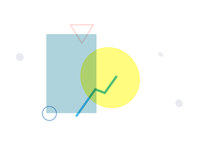
I wanted to create a series of illustrations for it that created mood in the article without being too literal or fighting for attention with the content; something that both made the piece more interesting while also simplifying it. The end results were a series of abstract geometric shapes, borrowing both color and rhythmic qualities from 80s era design, while also including softer colors that aim to call to mind Pantone's color(s) of the year. Each shape is an abstraction of the subject matter and is used to break up the sections of the article.
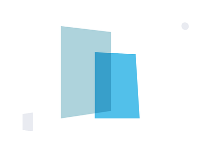
This one represents business in the article. The rectangular shapes intend to mirror the stereotypical shape of business: large high-rise corporate buildings, and the blue representing the now cliché use of blue to represent feelings of longevity and trust. The "boxes" made by the rectangles also reflect the sense of habit and inside-the-box thinking that sometimes persists in traditional, bureaucratic companies. An intended contrast to the free-flowing and oft forward thinking nature of design.
You can see it in action here.