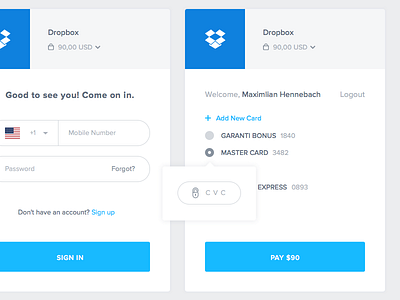
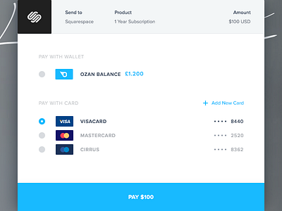
Checkout
At the end of the day, we are facilitating payments, and payments have come to mean “checking out online”.
We have previously shared an initial draft for our “checkout” screens. After hours and hours of fine-tuning and testing, we were able to come up with a sleeker design and prevent possible UX annoyances.
Tell us what you think.
—
If you want to be informed my works please follow my Dribbble | Twitter
Had a question or something want to write to me. Feel free to contact me; E-mail
More by Enes Ateş View profile
Like


