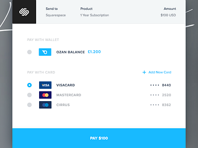
Checkout - Wallet Screen
A partial shot from a work in progress… This is a screen directly out of the workflow we shared earlier.
The challenge here is to provide all payment options and necessary information as neatly as possible without bombarding the user with unnecessary details and overcrowded design.
Give us your “L” and follow us for more to come.
ps. See attachment for the retina version.
—
If you want to be informed my works please follow my Dribbble | Twitter
Had a question or something want to write to me. Feel free to contact me; E-mail
More by Enes Ateş View profile
Like


