Design Elements of Mobile App | The Airfield Guide

Hello, everyone! 🤩
Today, we are excited to present the branding of The Airfield Guide. 🎉
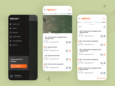
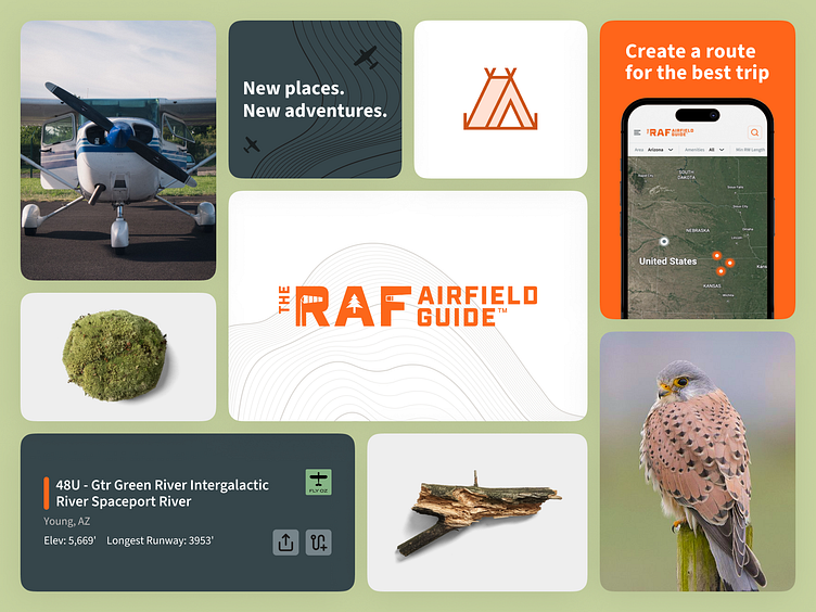
The Airfield has a bright and attractive aesthetic that captures the spirit of new destination exploration. The green accentuates the adventure, the orange adds a touch of energy and enthusiasm, while white and gray provide a clean, modern balance. This harmonious blend of colors embodies the excitement and allure of uncovering hidden destinations. ⛳️
A vivid photo of an airplane, which occupies a prominent place in the app, emphasizes its focus on aviation. This dynamic image attracts users and sets the tone for their journey with The Airfield. 🛫
A compelling call to action, such as "Create a route for the best trip," encourages users to engage. Together, the colors, image, and call to action create a cohesive and engaging identity for The Airfield app. 🏕️
Stay tuned for more! 💙