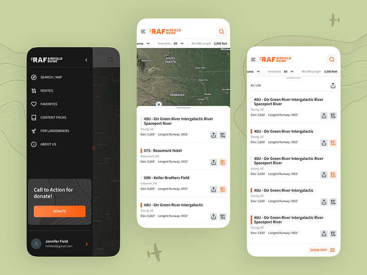
Map and List Screens of Mobile App | The Airfield Guide
Hello, everyone! 👋
Today, we aim to highlight the design and development process behind The Airfield Guide app. 🎉
The mobile version of The Airfield Guide enhances user experience with a streamlined sidebar for easy navigation. This sidebar provides quick access to essential internal pages like Search/Map, Routes, Favorites, Content Packs, For Landowners, and About Us. ✈️
Central to the user interface is the Map/List screen, which plays a pivotal role in navigation. At the top of this screen, users find a filter option that allows for precise searches based on specific criteria. Below the filter, a list of boarding points is displayed, enabling users to select stops conveniently along their chosen routes.
This main page is optimized for logged-in users, ensuring that interactions are seamless and efficient for journey planning purposes. The design focuses on simplicity and accessibility, aiming to provide a user-friendly experience that supports both exploration and practical navigation. 👍🏼
Share your thoughts and keep an eye out for further updates! 💙


