SoundHound Android AppWide ID FAB
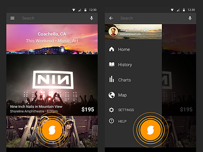
The basic premise with this UX improvement was to increase the % of positive matches on time sensitive environmental audio by placing the ID button in a visible and instantly accessible location throughout the app. This design also resolved the waterwheel app navigation structure caused by having the ID button only available on the apps home page (see flowmap). I positioned this high-traffic button in the upper right corner in order to avoid overlapping its hotspot with the ad banner in the free version of the app. The apps UI styling and waves animation was to be consistent with the home ID button at the bottom of the activity in order to convey the same function. Starting an animation however was to have the ID screens waves eminating meaningfully from the top tap target in order to not mess up the users spacial mapping on during the transition.
Ialso experimented with the idea of the ID button acting as the voice recognition and voice command button when held. This solved space and learning problems with having two audio input buttons next to each other. Most importantly it allowed for quickly combo-actions by only using the audio interface, for example: tap to ID song, hold again to command "share song to Facebook".


