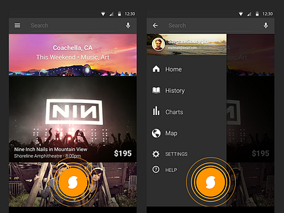
SoundHound Android Redesign 2013
UIX navigation drawer and app-wide identification FAB I designed for the SoundHound Android app in late 2013. The new ID button utilized the flat S symbol and floated on the z-axis above all other interface elements, emanating waves to let the user know it was pre-listening and/or picking up music. The actionbar consisted of three easily identifiable and accessible elements: navigation, text search and voice search. The feed featured rich edge to edge graphics based on Airbnb's design.
Attached some iterative work for how I got to the FAB before the Lollipop FAB element was announced. I did a lot of market research and found that the Path action button and Foursquare check in button at the time would serve SoundHounds ID purposes best.
More by 7 View profile
Like


