magicat
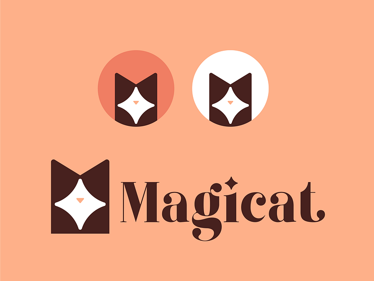
I've made some revisions to the Magicat logo. I decided to soften the star, making it more rounded and friendly rather than sharp and edgy. Additionally, I made a slight tweak to the font by adding a star on the 'i', which enhances its connection to the icon. Also, here are some potential social media profiles for the brand :)
More by logorilla View profile
Services by Badr errouichaq
Like
