My Varations
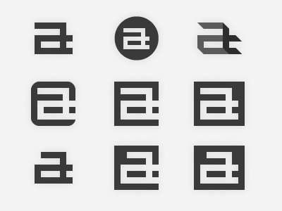
more variations of yesterday's shot (which is in the middle). I do like these more than my current mark, but am still exploring my options.
top right was an interesting variation that I kind of like, as it has a 3D-ish feel, as if it were floors/planes being seen in perspective.
Some of them don't show the 't' as much, but thats because its not really something I'm going to emphasize - I think the letter 'a' and my own name stands out enough. :)
any feedback/suggestions? which ones do you like most? thanks :)
More by Aldrich Tan View profile
Like

