me
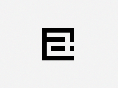
Trying to redesign my current logo, still keeping the "a" and "t" as a single piece.. Lately, I've been attracted to very simple, blunt edged visuals...
feedback and suggestions? Do you think its better than my current one (which isn't really that great anyway!)?
Thanks! :)