Day 15 • One/Off Switch
Hey friends and followers,
For day 15 of the DailyUI Challenge my subject was On/Off Switch.
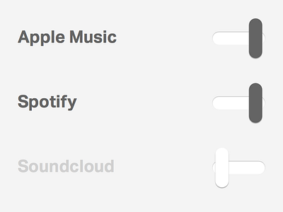
I thought this would be a good opportunity to build off an existing design of mine. My dream music app with universal search through all your music services may never happen but one can hope. This is how I see the toggle system being designed for those said music services. This of course would be found within the app itself as a goal would be for the user to never have to leave the app.
Inspiration for the toggles comes from old radio switches. An added functional benefit as a result of the visual aesthetic is that you can immediately tell which services are toggled on and which are off without thinking. The hard contrast alone is unmistakable, let alone the switching of sides.
Surprisingly very happy with this seemingly simple challenge.
I invite you all to rebound this shot and create your own visual exercise.
Check out the project at www.dailyui.co
See you tomorrow!
#dailyui #daily100 #day015


