Horizons - Healthcare App Landing Page
Overview
Horizons is a revolutionary healthcare app designed to transform the way individuals engage with the healthcare system. With a focus on providing comprehensive and accessible healthcare services, Horizons aims to bridge the gap between patients and healthcare providers, ensuring a seamless and patient-centric experience.
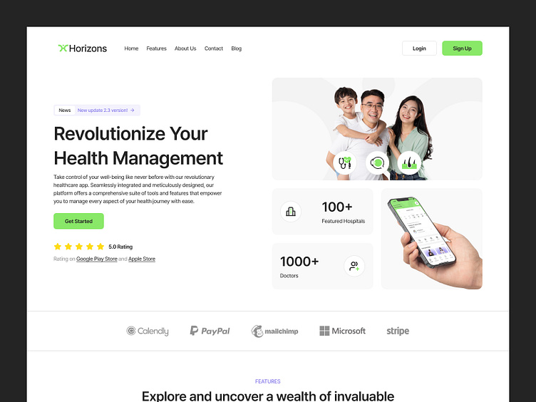
This is the landing page of Horizons
Problems
Limited Awareness and Engagement:
Many individuals are unaware of the range of healthcare services available to them, resulting in low engagement with preventive care and health management.
Information Overload:
Patients may feel overwhelmed by the abundance of healthcare information available online, making it challenging to find relevant and trustworthy resources.
Objectives
Streamline Healthcare Access:
Develop a landing page that serves as a gateway to streamlined healthcare access, providing users with easy navigation to essential healthcare services.
Curate Relevant Information:
Provide curated and trustworthy information about healthcare services, conditions, and wellness resources to help users make informed decisions about their health.
How We Solved the Problem
Clear and Intuitive Design:
The landing page features a clean and intuitive design, with easy navigation to key sections such as appointment booking, telemedicine services, and health resources.
Call-to-Action Prompts:
Clear call-to-action prompts guide users to take specific actions, such as downloading the app, scheduling an appointment, or signing up for newsletters, enhancing user engagement.


