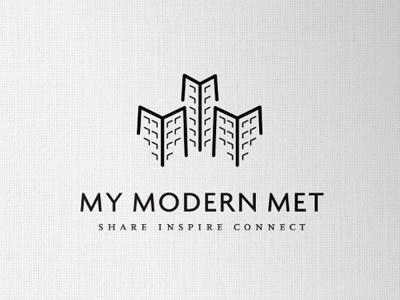
My Modern Met Logo
A revision to the brief means trying to incorporate a little more detail to show towers as buildings. Which is a link to the Met (metropolis) aspect.
The 3 buildings are formed from the 3 M's as well as conveniently incorporating 3 Y's, focusing on the MY. Realise the 'Y' link is dubious to say the least, but it's there. :)
The idea was not to make the buildings too realistic, as the main idea was to focus on the M's. The base of the 'buildings' are slightly splayed out to match the font, which is Today SB Medium.
Can't help but assume this must be like something else out there, but not seen anything yet on my travels. The whole concept of buildings and initials have been done quite a lot, so if anyone has seen anything like this, would appreciate a head's up.

