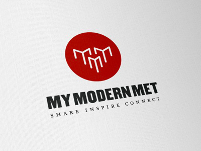
My Modern Met Logo
The brief has seen some drastic changes in direction, so this is my latest interpretation of the brief.
New logo/header design for website MyModernMet
Given that 'Met' is short for Metropolis, the client wanted to see if there was a iconic way to incorporate buildings, a sense of structures, with the 3 M's and 'My'. After some playing around, I ended up with this representation of those meanings.
3 buildings, formed from the 3M's, with the center vertical forming the 'Y', so each "M' is also a 'My'.
There is also a subtle 'down arrow' formed from the negative space in the middle of the top two, which is a loose meaning of 'share and connect'. As well as the whole mark creating an 'arrow head'.
More by Smitho.graphics℠ — Logo & Icon Design Studio View profile
Like

