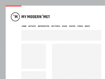
My Modern Met Logo
This is a new logo design idea for an existing website, an image and inspiration website along the lines of Picocool etc. You can see the existing logo and website here : MyModernMet
Wanted to show the new logo idea in context of the website environment as this is where it will be used mostly.
There are two sub brands, My Modern Mix and My Modern Met, each with their own website and theme. So the task was to create a new and recognisable logo that could be adapted for new themes, but retained a solid core identity.
I wanted to create something that was simple, clean and focused on strong type and icon. Although the website is not part of my brief, I decided to re-hash the existing website design, adding a subtle coloured border. The idea is to show the client how the colour can be effectively used to differentiate websites, whilst retaining this simple core foundation.
Given the arty and creative nature of the users, and that the websites first and foremost are all about the 'content' rather than the actual 'site', I am hoping this will create a identity they can get behind and want to 'own' and be excited to be part of it.
