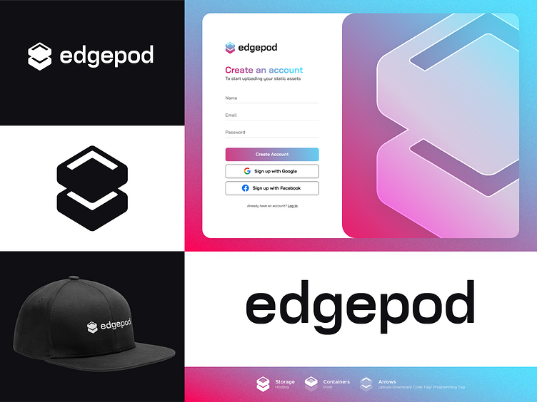
EdgePod Logo Concept Approved
EdgePod is simplifying the static site hosting. When static assets are uploaded (in many ways, but most likely as a zip file): HTML, CSS, images etc and Edged is hosting it globally via fast CDN.
In this concept, the logomark is inspired by the shape of the storage to speak out the Hosting as the business is about Static Site Hosting. This might refer also to the word Edge (Edge Server). The upside of logomark is also designed to form a container that can have things to be stored (some kind of Pods). The negative space also forms arrows representing ups and downs (upload - download like how hosting or the internet works). The arrows at the same time remind the audience of codes/programming tag.
More by Ardiann Fauzi View profile
Services by Ardiann Fauzi
Like

