EdgePod Logo Concept
EdgePod is simplifying the static site hosting. When static assets are uploaded (in many ways, but most likely as a zip file): HTML, CSS, images etc and Edged is hosting it globally via fast CDN.
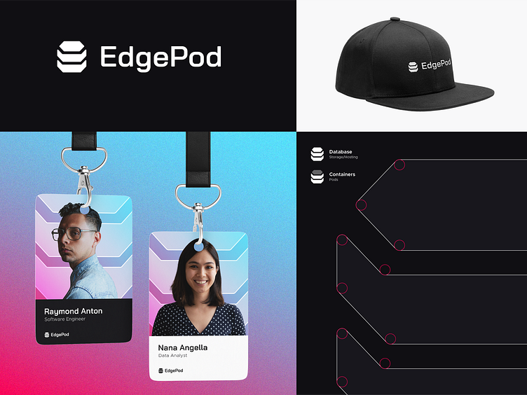
In this concept, the logomark is inspired by the shape of the database shape to speak out the Storage/Hosting as the business is about Static Site Hosting. This might refer also to the word Edge (Edge Server). The logomark is designed to be a hexagon stretched in height and has 3 objects. These create the shape of some containers with their content to refer to some kind of pods with its peas.