Krispy. Campaign Info Page.
Hello there, Dribbblers 🙌🏻
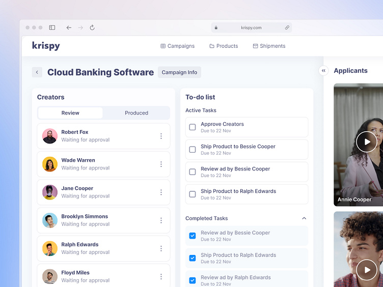
We continue to share screens for Krispy with you. Today, we are presenting the campaign page.
The page is divided into several sections. The first one is "Creators." In this section, the campaign manager can see which content creators want to participate in the campaign. At the top, there is a tab bar that switches us to the creators whom we have already approved for the campaign.
The next section is the To-do list. In the flow of extensive information, it's easy to forget to send products to the creator for a review or check the completed videos for the campaign. Therefore, the user can immediately jot down tasks that need to be done and set their due dates. It's possible to view both completed and pending tasks.
The third part duplicates the first list with reviews. However, here you can watch videos of those who are interested in participating in your campaign.
If you what to start a project, contact us via hello@equal.design
Analytics over hypotheticals! We are ready to cooperate!
hello@equal.design | equal.design
❤️ Follow us to stay involved 🏆

