Day 19: Construction-influenced W
This is Day Nineteen of Thirty Days of Logos, in which I share a new logo idea for my design studio, Wildfire Studios, every day for 30 days.
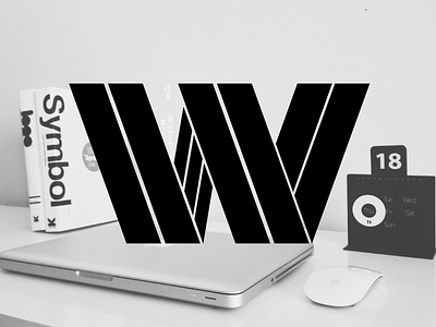
I've been working on this one for a couple weeks; I wanted to create a logo that took hard lines and turned them into a letter. What I like about this is the potential future: imagine animations where each line had keyframe motion and became another letter, like the F in Wildfire or the S in Studio. That has some serious potential to me. (It's not perfect; I think the angles for the lines pointing to the right could use some love, but it's a start.)
I also think this has an element of class. I'd be interested in developing a typeface that had this look to it all the way through; it would be an interesting challenge for a display face.
But at the same time, this isn't necessarily what I want my brand to look like. To me, this looks like a hard-working company, one that belongs out in the field somewhere — a photographer, a journalist, a construction worker, anybody getting their hands dirty. But I don't feel like a digital designer qualifies among those things.
That being said, maybe this is something to revisit for the next brand identity.
Insofar as the typeface goes: if I wanted to develop this as a typeface, what would you folks recommend doing as a great way to learn the craft? What software do I need to get started?