Day Two: New Watermark
This is Day Two of Thirty Days of Logos, in which I share a new logo idea for my design studio, Wildfire Studios, every day for 30 days.
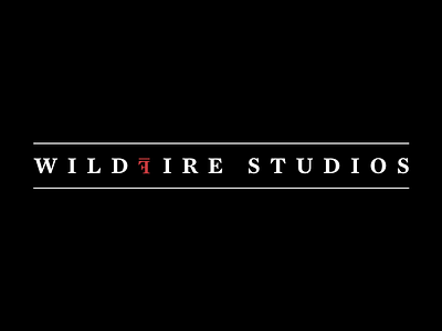
This watermark needs to be touched up a little bit. The F could certainly be smaller; the line above it could be thicker and the spacing could be more generous. What I like about this is the letter-spacing (it could be more generous still, but I wanted to make sure it fit in a shot), and I love the typeface (Mercury, if you're wondering).
This doesn't work well on a website (I've tried), but it would look great on the back of a business card with a sans-serif typeface beneath it. That's the intent. And the black and white gives it a real sleek feel. My favourite business card ever was black with red and white lettering; this is almost a throwback.
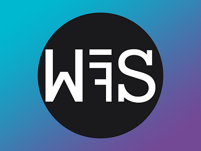
As a word mark, I dig this, but it doesn't satisfy my needs for a unique symbol.
Edit: What I really like about this is that it looks like something straight out of Hollywood. I'm a huge fan of most of the Hollywood logos. They're strong, bold, evocative. I think this word mark is similar in feeling and tonality.