Day One: The original logo

Today, I'm starting something new. I'm sharing a new idea for a logo for my studio, called Wildfire Studios, every day for the next 30 days. I'm doing this to challenge myself and to force myself to share my work. Check out each shot's rebound to see the one that immediately follows it.
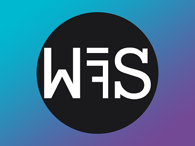
This is day one of 30. This is the original logo that I made two years ago. It has served me well, but it does not work well on small screens (it stinks in the navigation menu on a mobile website). And while it's flexible, it's starting to show its age.
Why else am I making a new logo?
- this logo is made using three different typefaces. (I know. Bad Nathan!)
- people often got confused by the reverse F and spun my business card around a bunch of times trying to figure out why they were "holding it wrong." To be clear, that's my bad, not theirs. No design should be that confusing.
Tomorrow: a new word mark idea that I'm really digging.