Lyft iOS Mode Selector Sub-modifiers & Nav Drawer Screenshots
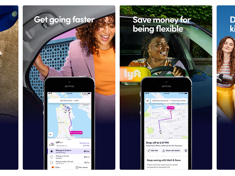
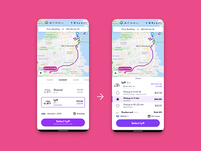
Two of my contributions to the Lyft app are being shown off in the 2nd and 3rd screenshots. I figured out the UX to compress the rideshare mode selector to fit Priority Pickup, Standard and Wait & Save cleverly into one tile of real-estate. On the 3rd screen, where as navigation was hidden under a PFP icon I was able to demonstrate through growth experiments that it needed to be an icon for customers to understand what it did
If you like it, don't hesitate to click "L" 💗 or "F" + "Follow"
👇 Follow us and get the app now + review us 🌟
Sprocket Bicycle App on Android
Sprocket Bicycle Blog on Instagram
More by 7 View profile
Like

