Lyft Mode Selector Modifiers Hackathon Ideation to Launch
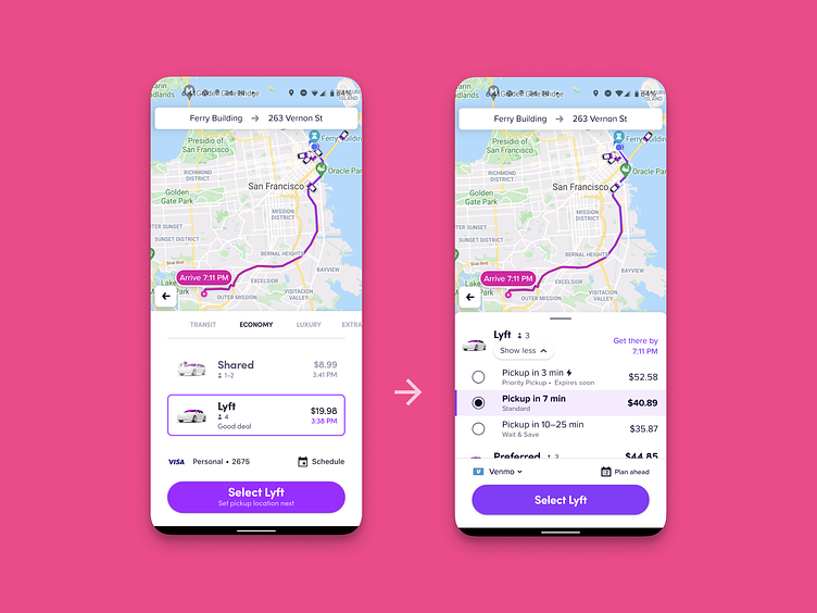
Found some old designs for how I came up with Lyft's Mode Selector modifiers UX in order to compress and optimize the selector while increasing the amount of options and their intuitiveness to riders. Essentially like SoundHound I was exploring if it was possible to turn Lyft into a two-button app. While as a growth designer, this was outside of my area of responsibility - I came up with the solution during a Lyft hackathon and passed it over to the core team for polish; who to my delight ended up shipping it!
If you like it, don't hesitate to click "L" 💗 or "F" + "Follow"
Sprocket Bicycle App on Android Sprocket Bicycle App on iOS Sprocket Bicycle Blog on Instagram Sprocket Bicycle Blog on Tumblr Sprocket Bicycle Blog on FB
Wireframes where I explored how to cram more information into less space. You can see initially im riffing off of the Pinterest FAB menu system. I then fairly quickly arrived at the idea that some of the modes can be modifying options within an over-arching main mode. I then spent time trying to figure out how to represent modifiers on a modes tile and ultimately settled on using chips as a short-term solution for the hackathon
I then presented a video walkthrough of how and why it makes sense to collapse the current huge selector into this new paradigm
Here im showing that every main mode that is not shared is essentially a "Fast(er) Mode" because you select it to get somewhere faster than shared ( despite their different names and illustrations )
... and in fact that they can be deleted as there are pretty much really only two big modes in the app, or two buttons.
Showing how the affordance would mod the tile for the one they all pertain to
Then highlighting how compressing so much pixel real-estate frees up space for potentially including other new modes that can be found by customers in an intuitive and easy to use manner
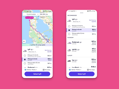
As you can see my janky hackathon UX was pretty close to the UX version which ultimately shipped with a better looking and slightly more ergonomic vertical expand/collapse menu of modifiers for modes which used to be separate tiles!


