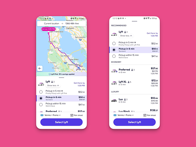
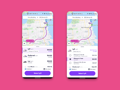
Lyft Mode Selector Modifiers Comparison Shopping UX
Another example of my modifiers UX in action when pulling up on Lyft's ride modes - showing how effective a compressed and organized mode with sub-modifiers is at optically organizing and conveying value within a compressed real-estate when being compared against the rest!
You can also see the Lyft Pink V2 version of the initial discount banner I designed
If you like it, don't hesitate to click "L" 💗 or "F".
Sprocket Bicycle App on Android Sprocket Bicycle App on iOS Sprocket Bicycle Blog on Instagram Sprocket Bicycle Blog on Tumblr Sprocket Bicycle Blog on FB
More by 7 View profile
Like

