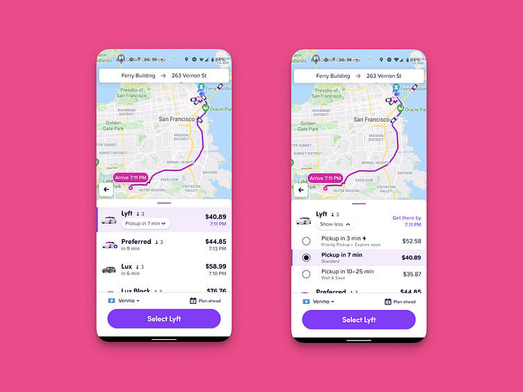
Lyft Mode Selector Modifiers UX
Working on the Lyft Mode Selector in 2019 it became obvious that we were overloading it with too many options. I hacked a UX solution to this during a hackathon which allowed us to cram more options into the existing realestate in a meaningful way to beat @Uber. I called it modifiers and it allowed us to make available sub-modifications for modes, instead of simply adding more modes for every variation, to an already cognitively difficult to scroll list. Happy to see my UX concept ship for the standard Lyft mode - check it out when you use the app next time! :D
note: These are actual implementation screenshots not Figma mockups
If you like it, don't hesitate to click "L" 💗 or "F".
Sprocket Bicycle App on AndroidSprocket Bicycle App on iOSSprocket Bicycle Blog on InstagramSprocket Bicycle Blog on TumblrSprocket Bicycle Blog on FB

