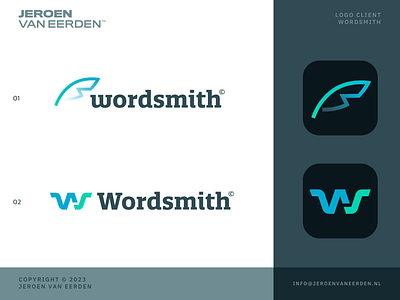
Wordsmith - Logo Concept 3
Logo design for Wordsmith - Medical Writing - Concept 3
Offering top-notch services for medical writing, editing, formatting, and publishing of regulatory documents to pharmaceutical and biotech companies.
Worked on a new concept where the letter S is more prominent. I tried to include two feathers (digitally abstract) that form this shape together. Kinda liking the idea of a more simplified design, where the W isn't needed to be seen.
Happy to hear your thoughts.
Hit L for support!
Have a lovely weekend, everyone!
___________________________________________________________________________________
___________________________________________________________________________________
Let's work together and elevate your brand! 🚀
Feel free to reach out via Dribbble DM or E-mail:
👉 info@jeroenvaneerden.nl
💼 Connect with me on LinkedIn / Read my Client Recommendations
🎬 Check my YouTube for Logo Tutorials / Learn Logo Design
🔗 Follow me on Instagram / See BTS and New Content
🛒 Buy my pre-made or unused logos from the portfolio
💬 Tweet with me

