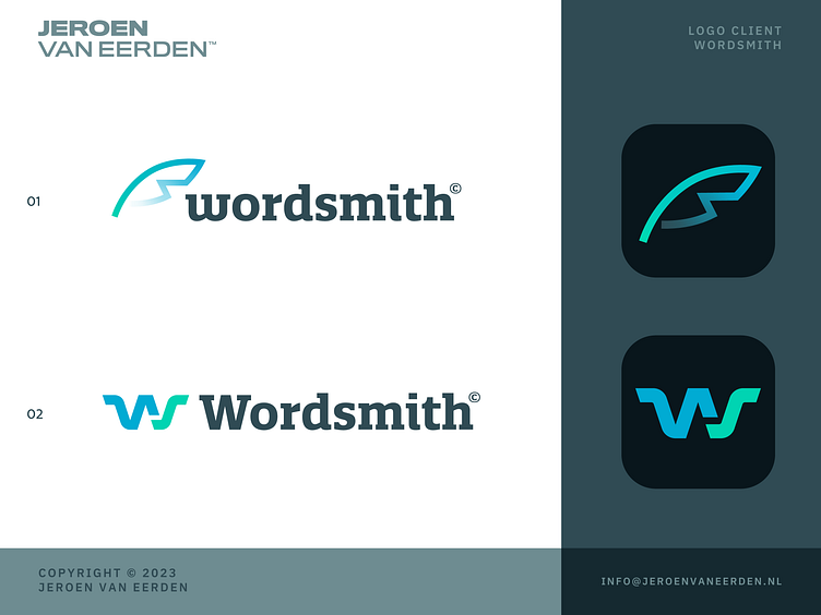
Wordsmith - Logo Concepts
Logo design for Wordsmith - Medical Writing - Concepts
Offering top-notch services for medical writing, editing, formatting, and publishing of regulatory documents to pharmaceutical and biotech companies.
After the first session of revisions, I simplified the initial concepts to avoid too much 'superhero' vibe with the badge. A new concept (01) captures the idea of a writing pen/feather + letters W and subtle S. Applied a soft and fresh gradient to create more depth within the mark.
Happy to hear your thoughts and which concept works best for you.
Hit L for support!
___________________________________________________________________________________
___________________________________________________________________________________
Let's work together and elevate your brand! 🚀
Feel free to reach out via Dribbble DM or E-mail:
👉 info@jeroenvaneerden.nl
💼 Connect with me on LinkedIn / Read my Client Recommendations
🎬 Check my YouTube for Logo Tutorials / Learn Logo Design
🔗 Follow me on Instagram / See BTS and New Content
🛒 Buy my pre-made or unused logos from the portfolio
💬 Tweet with me

