Seekaroo — Landing page

Background
The landscape of shipping and logistics services has become increasingly competitive, demanding a seamless user experience for customers seeking efficient freight solutions. Seekaro, a digital platform, aimed to address this challenge by offering an app that simplifies the search, comparison, and selection of shipping expedition services. The goal was to enhance user convenience, streamline the decision-making process, and establish Seekaro as a reliable shipping companion.
Objective
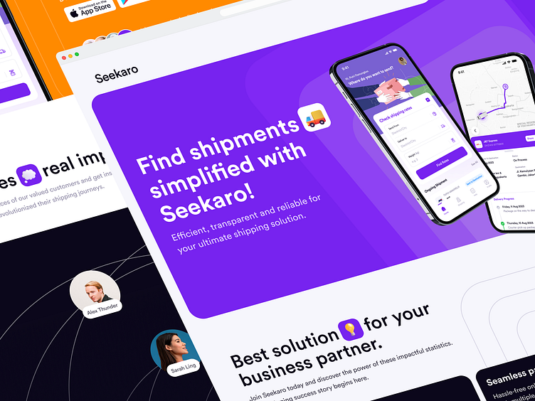
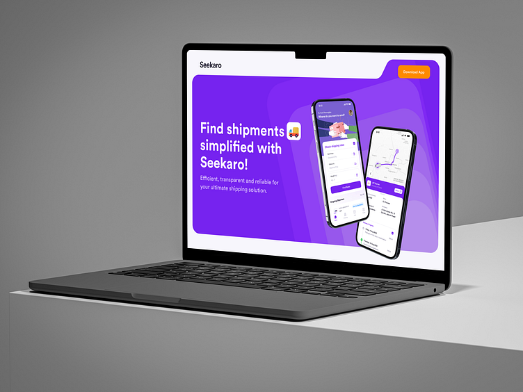
Seekaro landing page was to captivate users from the moment they arrived, guiding them through the app's key features and emphasizing its user-friendly nature. The focus was on illustrating how Seekaro simplifies the shipping journey while also building trust through user reviews.

Approach
The redesign of the Seekaro landing page followed a user-centered design approach, incorporating best practices in UX design and information architecture.
Streamlined Information Architecture ℹ️
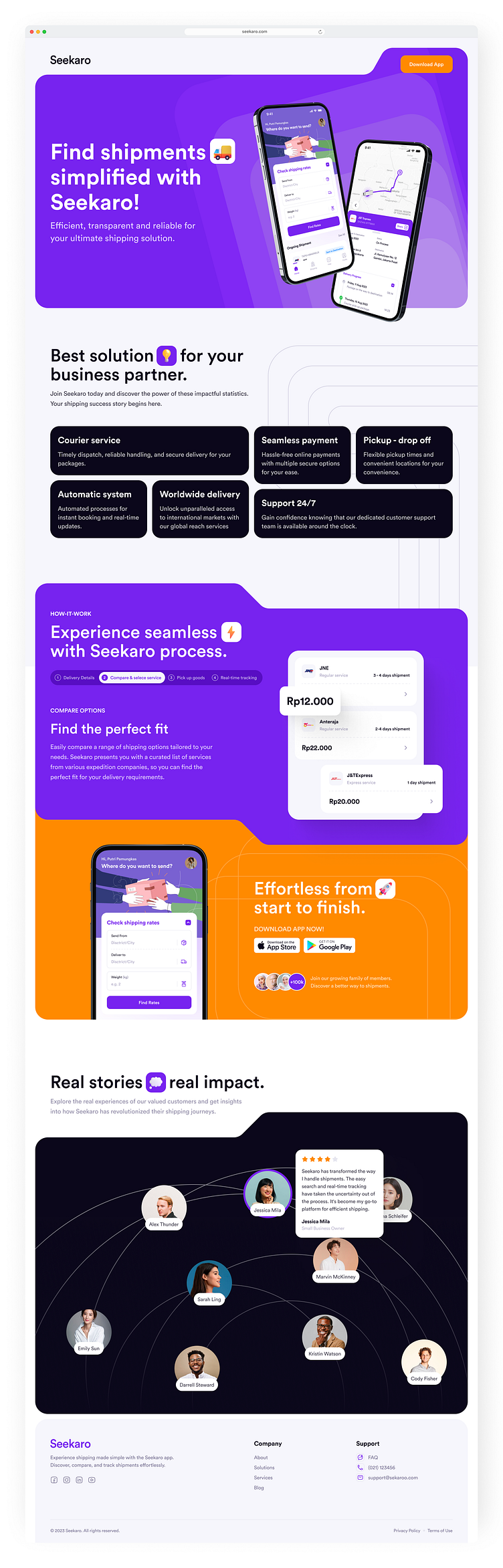
Landing page’s information architecture was organized to guide users seamlessly through the app's key features.
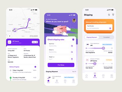
Clear and Engaging Visuals 🤩
Engaging visuals were carefully chosen to illustrate the app's benefits. A hero section showcased a relatable shipping scenario, capturing users' attention and encouraging them to explore further.
User-Centric Features 🫶🏻
Detailed UX copy elaborated on each feature, helping users quickly grasp how the app simplifies their shipping experience.
Trust and Credibility 🌟
Customer reviews were prominently displayed, showcasing real experiences and building trust among potential users.
Hope you like it. I would greatly appreciate your feedback.
We are open to new projects.
usercentra@outlook.com // hello.syafii@gmail.com
Press "L" for like. Thank you 🔥🔥🔥