Travel Website: mobile version
💌 Have a travel website idea? Let's bring it to life together!
hello@ronasit.com | Telegram | WhatsApp | Website
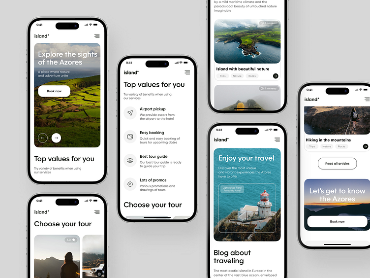
Hey, Dribblers! Meet our new mobile landing page that promotes the app where users can book tours to the Azores Islands. Let's dive into the details!
The landing page for this travel app includes a prominent main block describing the services, an advantages section, a tour selection block, a travel blog, and a section for purchasing tours.
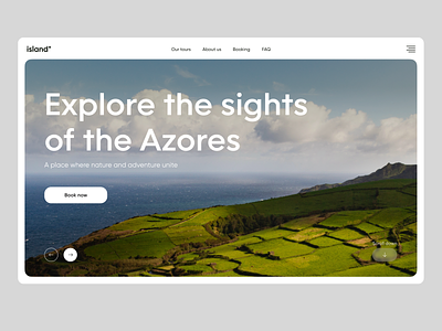
The main characteristic of this design is its seamless integration with vibrant photographs of the Azores Islands. The combination of a clean and contrasted design with stunning imagery creates an immersive experience for users and effectively convinces users to book tours.
As for the color palette, we have opted for a classic yet striking combination of black and white. This particular contrast helps to emphasize the vivid and colorful photographs of the Azores Islands, highlighting their breathtaking beauty and attracting the attention of users.


