Travel Website UI
💌 Have a travel website idea? Let's bring it to life together!
hello@ronasit.com | Telegram | WhatsApp | Website
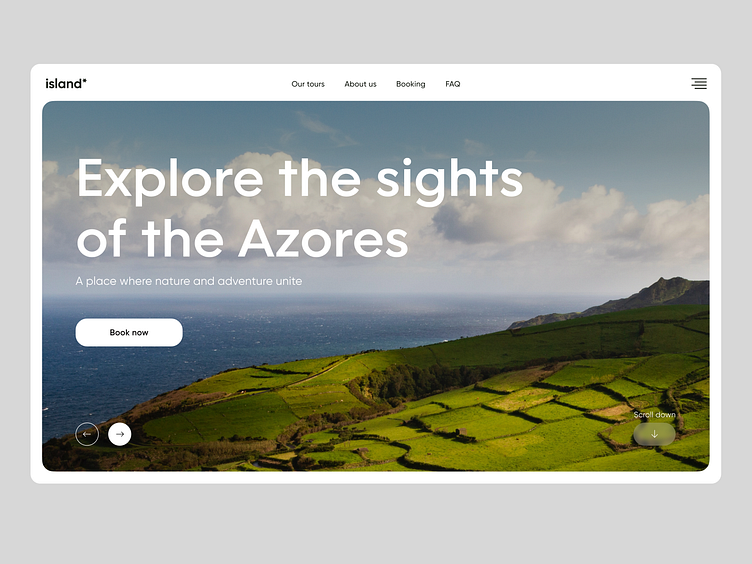
Hi everyone! We are thrilled to present the design of our new landing page for an app that allows users to book tours to the Azores Islands. Let's dive into the details!
The landing page for this travel app consists of several sections: the main block describing the service, a section highlighting the advantages, a tour selection block, a travel blog, and a section for purchasing tours.
The main characteristic of this design is its lightness, modernity, and visual simplicity. The travel app aims to highlight the incredible places that users will want to visit, evoking a sense of wanderlust and adventure.
For the color palette, we have chosen a classic but contrasting combination of black and white. This deliberate choice adds elegance and simplicity to the design, allowing the stunning locations and destinations of the Azores Islands to take center stage.


