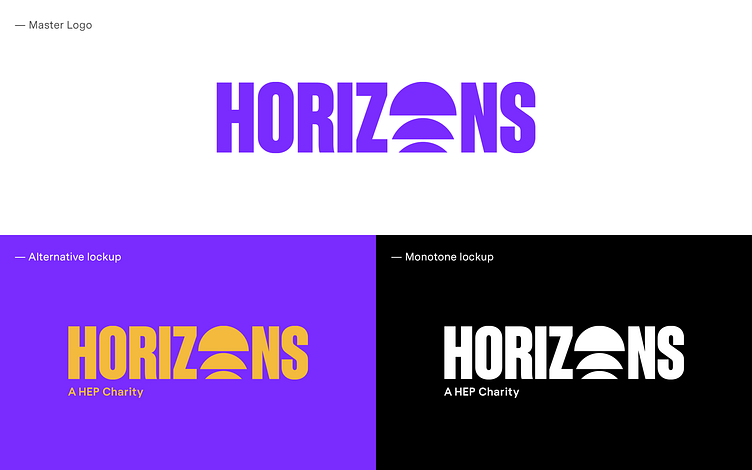
First draft logo concepts: Horizons
Our original concept for the children's charity, Horizons, was unanimously loved by the HEP Horizons team.
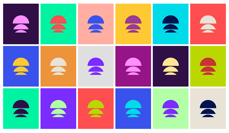
Formed from three semi-circular segments, suggesting a sun rising above the horizon, and symbolising the dawning of a new day bursting with opportunity. It succinctly summarised the hope and optimism that the charity was desperate to communicate.
Frustratingly — during our due diligence checks before our pitch — we identified another rebrand launched that same week that was just too close to our concept. We shared the bad news with the Horizons team and we ripped up the script and started again. These things happen, but it gave us a chance, and the challenge, of producing something even better.