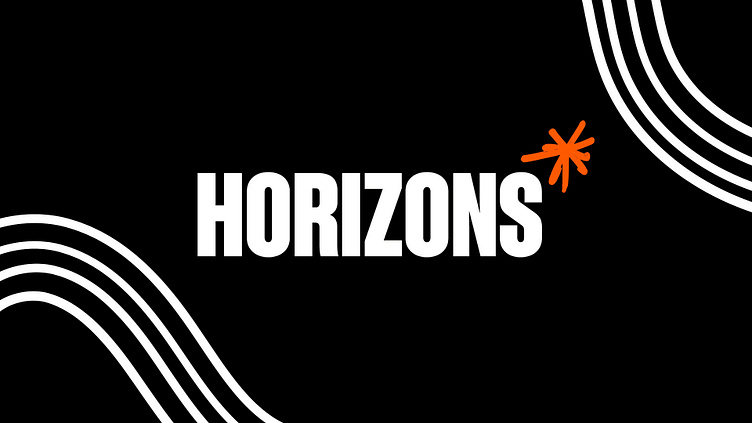
Horizons* children's charity brand identity
Changing the game for young people
Horizons mission is simple — to support young people to thrive in a rapidly changing world by providing equal access to sports, the arts, academia, and life-changing experiences. We partnered with the team at Horizons to create a brand that would give hope to many thousands of young people in London and beyond.
Our brief:
Create a visual identity for a charity intent on creating a fairer, more equal start in life for children and young people.
The idea behind the brand.
Founded by Haringey Education Partnership (HEP), Horizons operates in one of the most diverse boroughs in London with over 180 languages spoken and 38% being from BAME groups. The challenges of the COVID-19 pandemic laid bare the huge disparity in lived experience between young people and families, especially the unequal access to life-changing experiences. Horizons don't accept this to be inevitable. Our brand idea of 'All Children Deserve an Equal Chance' spoke directly to this mission.
A brand to inspire hope for the future.
Nephew crafted a logo and symbol that can be drawn by anyone, irrelevant of age, ability or background. Based on the form of an asterisk - a universal symbol that indicates something missing or an error needing to be corrected. For Horizons, it's a symbol of transformation, writing the wrongs of inequity.
Together, we make a change.
Horizons supports over 35,000 children across 100 schools. But to change attitudes, people have to come together and share responsibility. Horizon lines weave in, out and around every conversation unifying young people, their families, schools and the community in their pursuit of changing perceptions.
A bold, confident, and inspiring visual language.
The visual language is designed to amplify the voice of the unheard youth. Horizons speaks in the language of young people - bold, loud, expressive, and demanding attention but grounded in reality. The whole system is unapologetic, vibrant, and optimistic for the future.
A portal for what's on the horizon.
Online, Horizons packs an almighty punch. Everything is brought to life in delightful ways. Easily accessible events and experiences are the central focus. Donations can be taken with ease. Fully custom designed and built, in WordPress.
Credits:
Art Direction & Design: Ben Morgan
Motion Graphics: Harry Arundel
Web Design & Dev: Paul Bergin
--
Ready to get your brand identity transformed?


