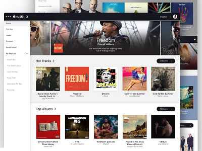
Apple Music Design Exploration
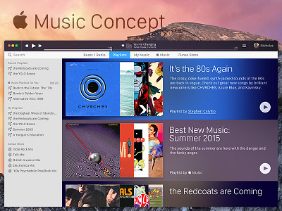
My friend @Stephen Calvillo has been playing around with Music redesigns for a while. We've been talking about it a lot, and I wanted to take a crack at some things, mostly focusing on usability and interaction (motion concept forthcoming).
Primarily, I wanted the Information Architecture to be a little simpler, so I consolidated things down to Beats 1 Radio, Playlists (local, genius, and Music), My Music (Local), Music (Subscription Library), and iTunes Store.
I dropped Connect because i think Apple probably will. It doesn't seem that much more sticky than Ping.
I also wanted that IA to transfer over to the search user experience, so when you type into the white bar where search is, the main window clears and you get search results broken into the IA I elaborated upon above, minus Beats because you can't search it.
tl;dr> I like some new things from Music (like the For You playlist treatment), but wanted to try to clean up the experience and just sharpen my skills a little. And to tease @Stephen Calvillo.


