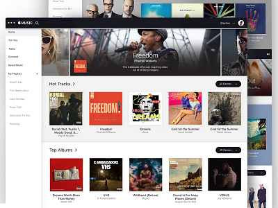
Apple Music Redesign
So to be clear, I wanted to redesign Apple Music from a visual style perspective. I think there are a lot of issues with the overall functionality, product thinking, and "features" with Music but ain't nobody got time to dive into that!
I wanted to embody the elegant style that Apple's website has. It's so sophisticated and visually stimulating while Music looks like an old janky music shop.
@Tom Koszyk does a great writeup on issues with the current product offering if you want to see it from a different perspective.
I also plan on writing a brief Medium post about my thinking but wanted to get some feedback before I go full detail.
Thanks!
More by Stephen Calvillo View profile
Like


