EGN: Case Study
Energy Group Networks (EGN) is a premium data centers based in California and Florida. EGN provides dedicated server hosting utilizing international colocation space that is designed to scale fast growing business.
Such a high-tech area also required a very modern website and brand refresh.
We wanted to capture a sense of the future and speed. To achieve this, we have chosen strict technogenic style and merge it with futuristic 3D-visualizations and spectacular background effects.
Basically two typefaces is more than enough for any project. But this time we have chosen three different fonts — each of them has its own function.
In addition to the homepage and the main service pages, we also designed the blog, jobs page, search and even the online shop for ready-made configurations. In total, more than 30 unique pages were developed for the project.
We were faced with the task of reinventing the company logo in a modern way, while maintaining some continuity with the past sign.
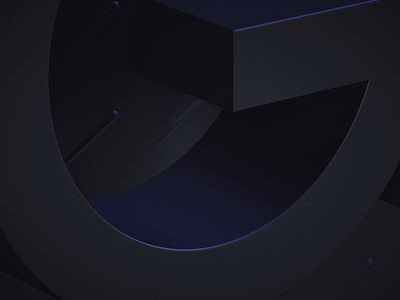
Treated the basis of the old logo with care, we kept not only the round shape of the sign, but also parts of the geometry. We managed to combine in this form the first characters from the abbreviation E (Energy) and G (Group).
But our particular pride is that we managed to find a way to insert an "on" sign in this combination of senses, which is really sick and important, because it's symbolises the main idea of internal uptime.
One of the greatest challenges in the project was data visualisation. When we are talking about data centres it’s not only about servers themselves, but primarily about what is stored on them. Data is too abstract a thing; it could be anything.
We created a 3D model of the server rack and visualised data as abstract colored swirls that are flying around the servers.
We hope you like the results as much as we do! Please, let us know about your thoughts in comments and press "L" to show your 🖤
Soon we will show more sick projects, with engaging interactions and cool graphics. So subscribe to us to stay inspired 🤩
___________________________
Team
Senior Designer: Denis Kondrashov
Junior Designer: Margaret Plotkina
Frontend / Backend: Kyrill Alexandrovsky, Nikita Nafranets
Project Manager: Olga Krupps
Art Director and Graphic Designer: Maxim Berg
Made by Sick.
Follow us:


