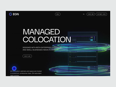
EGN: Logo
Hi friends!
Coming back with more stuff for EGN Networks.
This time we wanna give a look on logo works that we've done for them. That's right, we did not only web design and development but even total brand refresh.
Just to remind, our client provides premium data center services in California and Florida.
Task
We were faced with the task of reinventing the company logo in a modern way, while maintaining some continuity with the past sign.
Big idea
We treated the basis of the old logo with care and kept not only the round shape of the sign, but also parts of the geometry. We managed to combine in this form the first characters from the abbreviation E (Energy) and G (Group).
But our particular pride is that we managed to find a way to insert an "on" sign in this combination of senses, which is really sick and important, because it's symbolises the main idea of internal uptime.
We've also created the typo part of logo from a scratch.
That's it! We hope you enjoyed it. Please, let us know about your thoughts in comments and press "L" to show your 🖤
Another publication about this huge project is forthcoming, it will be the full case study with all scope of works. So follow us to stay tuned! 😉
___________________________
Team
Senior Designer: Denis Kondrashov
Web Designer: Margaret Plotkina
Project Manager: Olga Krupps
Art Direction, Branding: Maxim Berg
Made by Sick.
Follow us:


