hare war
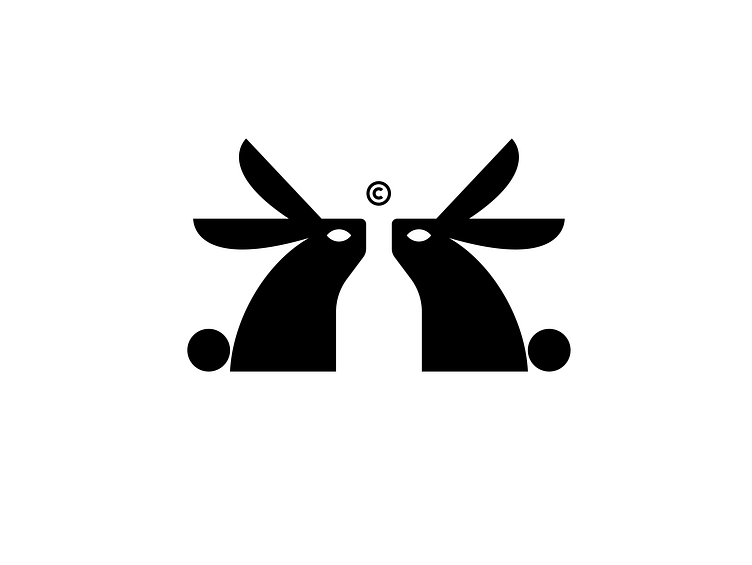
Hey Folks!Here is an initial concept im working on for a winery brand named hare war.The logo features a stylized image of 2 hares facing each others with an angry face. The hare is designed in a minimalist style, with simple lines and curves. The use of negative space creates a sort of abstract bottle . cant wait to discover the typography and the color palette to see the final results :D
More by Badr errouichaq | logorilla View profile
Services by Badr errouichaq | logorilla
Like
