Personal Website Prototyping – Iteration 3
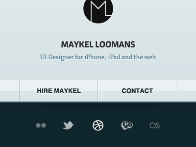
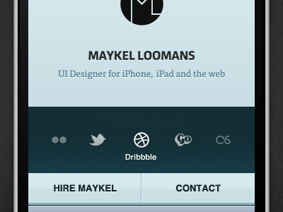
Evolution continued. Minor changes visually, large changes in the grand scheme of things.
After playing around after the previous shot a bit more, I decided the approach of outside-in could help in this case.
The iPhone layer was removed and quite quickly I found myself pretty happy with the next chapter in this design. Whilst it were just a few obvious steps, to me it kind of 'feels right'.
Check out the full-screen version to see the actual layout and ratio.
More by Maykel Loomans View profile
Like


