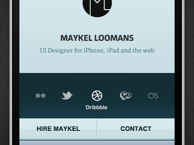
Personal Website Prototyping – Iteration 2
A rebound to the earlier shot. Went in a totally different direction during the day, just to find out I really liked the initial state. It just needed a lot of refining.
Especially looked at typefaces, typographic contrast and how the typefaces fit together. There was too much spacing in my name in the previous one, and the italic 'tagline' broke with the rest of the image.
Also looking towards some neat hover states (which will only work in the desktop version, of course – I'm looking for a way to give proper feedback on touch screens too.) as well as bumped the image up ten pixels, so there is a sense of contrast.
Still feel like the buttons should feel somewhat more (c)lickable. Full-size attached.
More by Maykel Loomans View profile
Like


